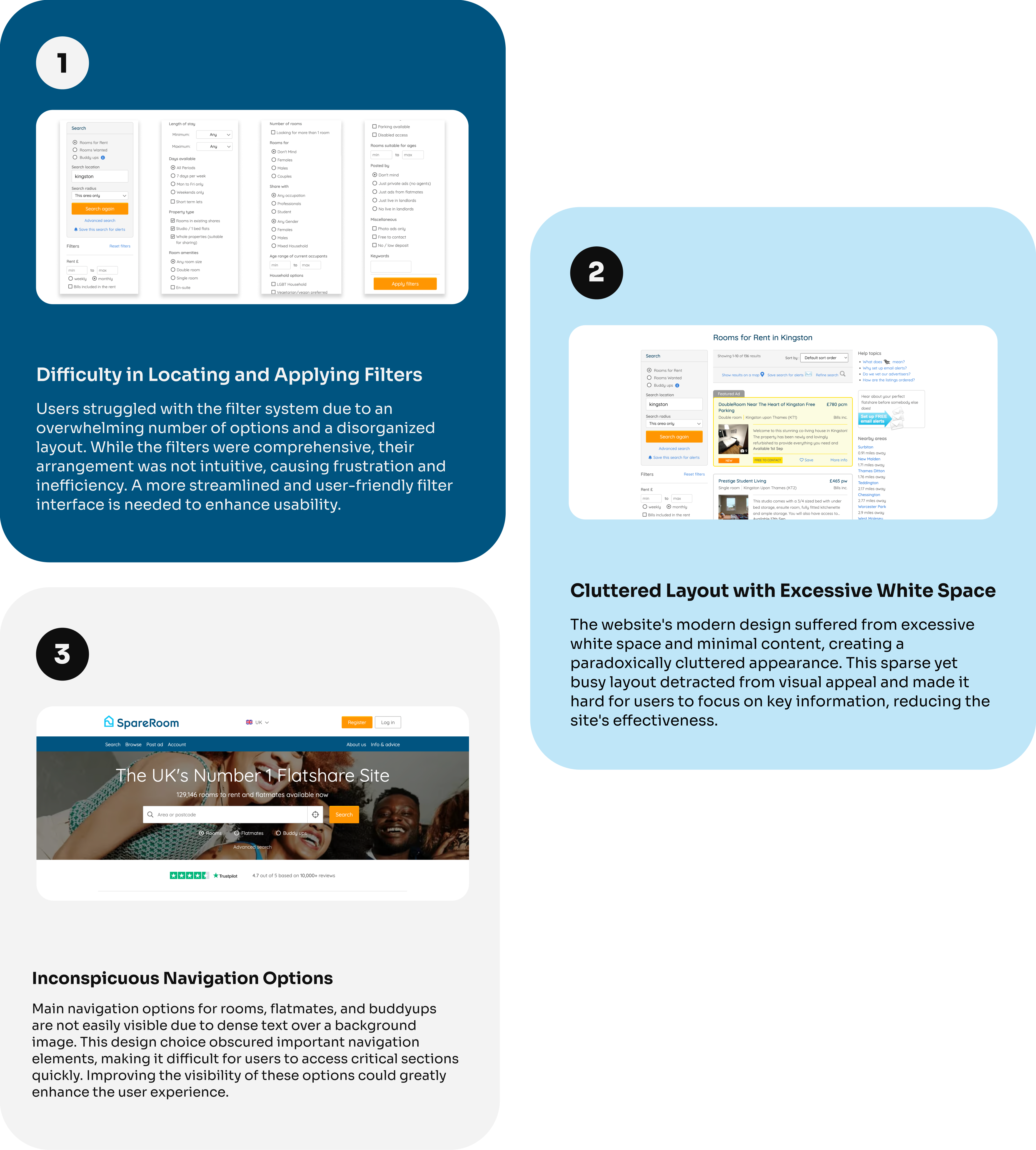
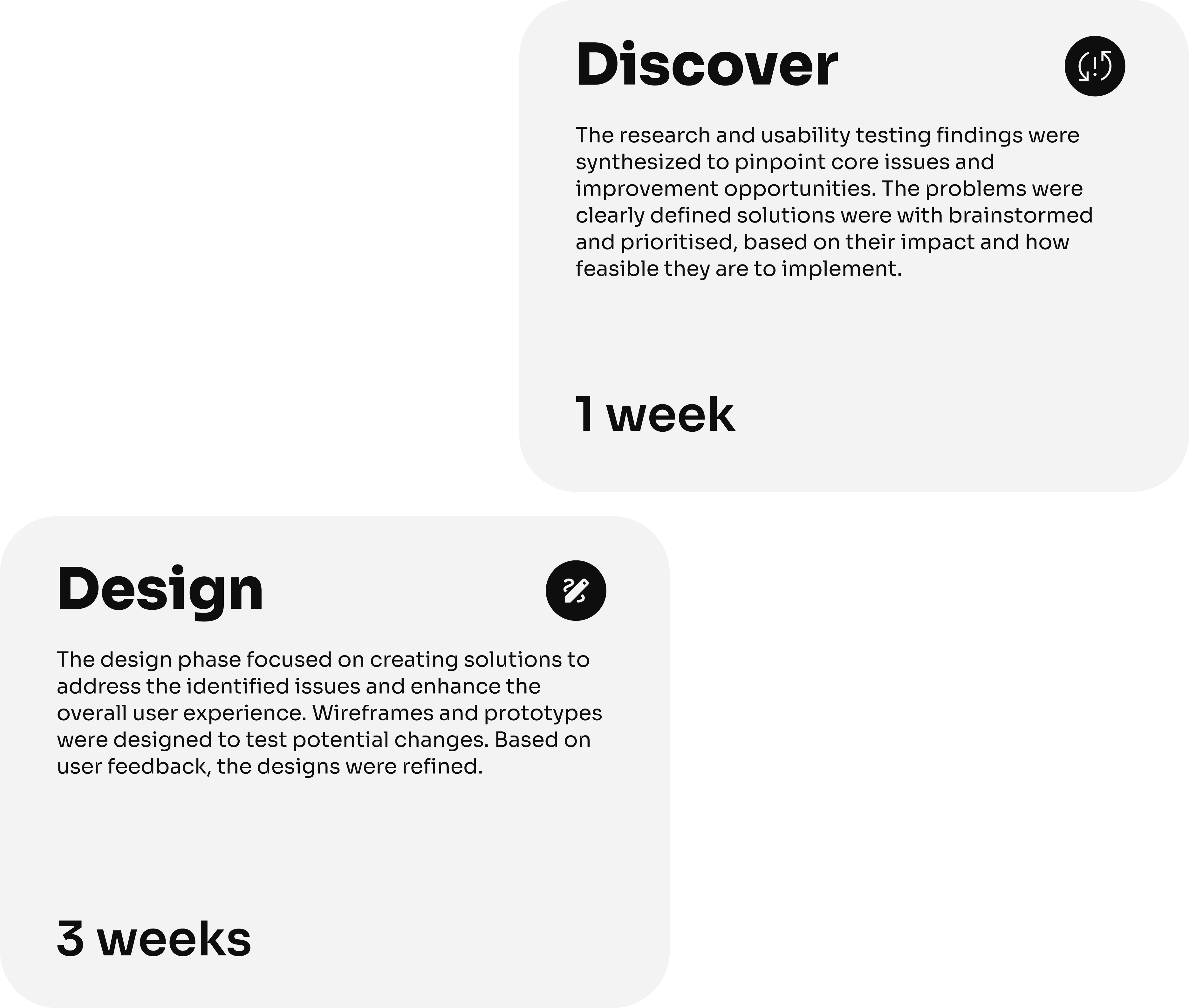
To address the difficulty users faced in locating and applying filters, we simplified and reorganized the filter options into clear categories, introduced a step-by-step filtering process, and enhanced visibility with visual cues and real-time updates. Filters were grouped into intuitive categories such as price, location, and amenities, reducing cognitive load and making the process more user-friendly.
Impact: As a result of the changes, task completion rates improved from 60% to 85%, and the average time to apply filters dropped from 3 minutes 45 seconds to just 2 minutes. This made the filter system much simpler and faster to use, reducing frustration and helping users find what they need more quickly.
For the cluttered layout issue, content density was optimized and consistent spacing guidelines were maintained to create a balanced and harmonious layout. By prioritizing key information with larger fonts, bold text, and contrasting colors, we established a better visual hierarchy. Engaging design elements, such as images and interactive features, were added to make the page more visually appealing.
Impact: These improvements increased visual engagement ratings from 2.5 to 4 out of 5 and readability ratings from 3 to 4.5 out of 5. This made the website look better and helped users focus on key information more effectively.
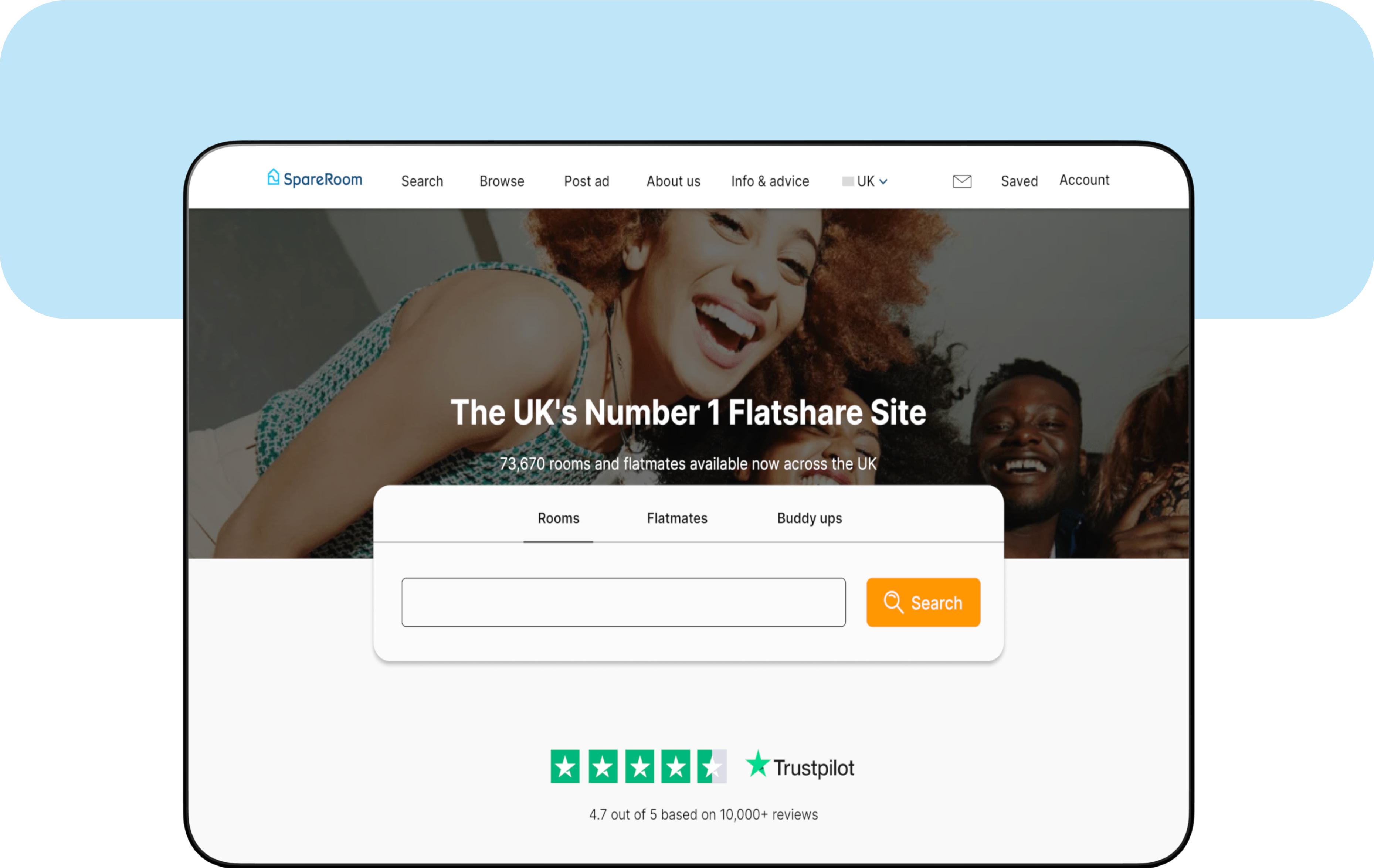
For better navigation, we positioned key sections like rooms, flatmates, and buddyups prominently at the top of the page with distinct buttons and icons. We minimized text density and ensured high contrast between text and background images to enhance readability.
Impact: These changes improved task completion rates for navigation from 40% to 75% and reduced the average time taken from 4 minutes 20 seconds to 2 minutes 30 seconds. This made it much easier for users to find and access important sections quickly, greatly improving their overall experience.